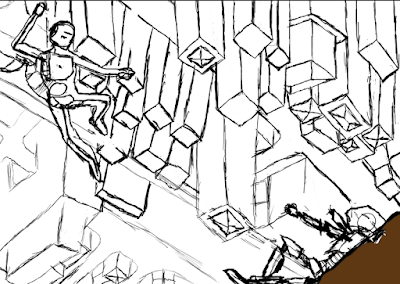
This is how my FMP will be displayed. Most of my other images are non-transferable from my blog and the original copies have since been lost.
I do not know how other artists using similar techniques display their works. I would assume due to the computerised nature of our pieces they will be displayed on a computer screen for display. It may also be possible that they are printed into physical copies.
If I could have anyway to display my work I would prefer to have it displayed as a large physical copy as I think it would make the piece seem even more impressive.
My ideal audience would be history buffs. people who enjoy pieces of art depicting historical figures. it may also interest people who like a bit of something out of the ordinary..
I will most likely be inviting my mother and brothers. This is because they are the only relatives who live close to the college.
I could possibly place an advertisement to friends on facebook. It may also be an idea to post on art focused websites such as deviantart and artstation to get my work out there.
Friday, 27 May 2016
Evaluation
Evaluation
of the Final Major Project
The theme of
my project was Warriors from different ages fighting in situations they could
not have been in in real life. My idea has been developed from the original in
two major ways. The first difference is that instead of focusing on a purely
martial arts themed fight it is now just warriors. The second, and most
significant, difference is that my FMP is no longer an animation and is instead
a Photoshop project as it was not as time intensive and allowed me to focus on
other parts of my project as well.
I did not
find much reference material to inspire my work aside from a few art pieces on
art station which are all referenced in my bibliography. The images that I have
found were useful as they allowed me to see and experiment with other peoples
styles of drawings similar to my own FMP. The images I have used as inspiration
helped to affect my design by showing me what type of armour and places my
characters would have worn and lived in.
My entire
project has been inspired by many ancient cultures. These include, but are not
limited to; the Roman Empire, Sparta, Medieval Europe and even Ancient China.
Many of the artists that I have performed my research on were inspired by either
Ancient Nords/Vikings or English Knights. All but one of the artists that I researched
used Photoshop as their main way of painting. The exception to this was Keith
Haring who used screen printing. He was also around before Photoshop.
I myself used
Photoshop to produce my Final Piece as it is the easiest piece of software for
me to use. Some techniques I used include blending my colours and the liquefy tool
to give the fire a semi-realistic touch.
I do wish I
had researched more about Vikings and knights as if I had I would have been
able to put out a more historically accurate representation of the two breeds
of warrior.
All in all, I
am pleased with the way my Final Piece came to be in the end. The parts I am
most proud of are the characters and the fire/smoke. I am happy with the
characters because, as well as shaded well, they are very dynamic and do not
look as stiff as some of my earlier attempts at dynamic poses. I am very
pleased with the fire and smoke because the fire has managed to blend in such a
way that it looks semi realistic, and the smoke helps add to that effect.
One thing I am
quite disappointed with is the very unrealistic and matte style colours. The
other artists that inspired this project all have ways to give a very realistic
feel and depth to their characters, making them seem like people who could
possibly be real. My characters however are most definitely cartoony and fake.
With practice I hope to overcome this limitation to my art style and next time
change my style to that of a realistic art piece.
Throughout
this project I have learnt many new Photoshop skills including; Blending, The liquefy
tool and using Dynamic poses.
I believe
this type of work is important to my games course as it allows me to
demonstrate my ability to produce concept art for games and films.
I did not
give this assignment my best attempt. If I had I would surely have been able to
produce the animation that I had originally planned to make. This, however,
turned out not to be the case as I did not manage my time efficiently enough.
By the time I had completed everything else it was much too late in the project
to even fathom producing a high enough quality animation. This led me to fall
back on my secondary idea of my Photoshop concept piece.
The class
activities that benefited me most during this project were most definitely
the lessons on dynamic poses
earlier in the project. The technique that I used most in this project that I had
not used a lot before is using soft brushes to blend colours. This gives the
colours a more natural look when they shift into one another.
Nearly, if
not all of these techniques could be used again in future Photoshop projects as
they are very useful skills to have.
One problem
that I had with my original sketch was that the poses were not dynamic enough.
I managed to solve this by adding shadow and making the robes flow to give it a
look as if he was moving. In the end I moved on to a new piece that went on to
become my FMP.
A second
problem was when I was trying to get the poses correct in my FMP. I managed to
solve this by getting two models to stand in my desired poses and took a photo
to base them on.
Ian Gofford.
Bibliography of Images and websites used.
Bibliography:
Images used:
https://www.artstation.com/artwork/DNVVA
(07/05/16). (Accessed: 15/05/16)
https://www.artstation.com/artwork/lNqdJ
(12/05/16). (Accessed: 15/05/16)
https://www.artstation.com/artwork/Ky0wB
(13/05/16). (Accessed: 15/05/16)
https://www.artstation.com/artwork/PGgVZ (n.d.). (Accessed: 29/04/16)
https://www.artstation.com/artwork/OawwJ (27/04/16). (Accessed: 29/04/16)
https://www.artstation.com/artwork/oWExB (09/04/16). (Accessed: 29/04/16)
https://www.artstation.com/artwork/YPJzP
(n.d.). (Accessed: 29/04/16)
https://www.artstation.com/artwork/zXZyL (11/04/16). (Accessed: 29/04/16)
Websites used:
http://gifmaker.me/ (n.d.). (Accessed: 17/03/16)
http://www.leninimports.com/keith_haring.html
(n.d.). (Accessed: 18/03/16)
Final Project.
This post is to explain and show my FMP. I have created a battle scene between a Nordic Viking and an English Knight. To create the stances they stand in I have used the image above to draw out the dynamic poses that they stand in. The original idea for my FMP was a short animation however due to my lack of time management I made the choice to change my FMP to a Photoshop project instead.
For the background I decided to go with the green hills and mountains that are often seen in the places Vikings once resided. The Mountains also allowed me to use them as a sort of frame for the action that will take place between the warriors. Having such high mountains and hills also allowed me to practice with blending colours to get a much more natural earthy colouration.
For this part of my FMP I based the homes off of traditional Viking homes which were made of wood and often had moss and other plants growing on the roofs.
In an effort to make it seem like a real fight between these two people I thought that having a raging fire in the background would give the battle some seriousness behind it and would not leave people believing that it might be a fight between two friends or siblings. To get the fire effect I simply lined the house with the colours in the fire and then used the liquefy tool to melt them together like the colours in a real fire do. For the smoke I just used a shaped brush and using quick strokes I managed to get a smoky effect.
Wednesday, 25 May 2016
The rule of 3 in my FMP
In the image above you can clearly see how the rule of 3 applies in my FMP.
The warriors in my piece are very clearly the focal point of the painting, this is because the variation in colouration and their positions make them the things that you focus on first.
The dominant form of the piece is the larger mountain in the back of the image whilst the sub-dominant form is either the smaller hill in the front or the houses in the back of the image. The mountains are in a very good place in the image as they frame the focal point but do not distract from it.
Pictures are most ascetically pleasing along the meeting points of the lines. One of these being the edge of the sword blade. The cross point meets where the blades are interacting.
Friday, 13 May 2016
Artist interpritation
This is my interpretation of the shoulder plate from Rastislav Le's 'Samurai Viking' piece.
At the top of the page you are able to see the colour pallet that I used to get the colours as correct as possible. When producing this painting I used a very soft brush with a low opacity as this allowed me to blend the colours and shades into a much more pleasing style than if it had been had I used a hard brush .
This piece was also built up in layers, whilst remaining only on the one Photoshop layer. It was started by sketching the basic outline. On top of that I continued to apply more and more colour and detail until it was built up to the final product.
Dynamic pose experiments
These are my dynamic pose experiments that I have drawn to practice with less stiff poses. These were done on paper and were photographed onto this blog which is why they appear after my FMP.
Friday, 29 April 2016
Crusader concept (W.I.P)
This is my WIP crusader concept. It is still very rough and will be neatened as time goes on.
Updated version. The cloak has been redesigned and the shading has been added to show the direction the light is coming from.
The shading is now coming along further than before and I am adding small characteristics, such as the cross. the shading here was completed by lowering the opacity and making the brush a lot softer than it was previously.
As of this point it has been decided that my character design is not dynamic enough and is much too static. as of this point it is cancelled.
Tuesday, 19 April 2016
Weapons and Armour mood board
These images will be used as inspiration for the main characters and their weapons in my Photoshop works. I will use these as well as the alternative mood board I already have.
Change in project type.
The final major project is the most important project of the course.The project that will decide if we as a group advance to level 3, or if we will be forced to drop games design. As of today, Tuesday the 19th of April, I have only 5 weeks and three days until project deadline, the 27th of May.
This short amount of time is no where near enough to create an animation worthy of a merit, the grade necessary to move to level 3. I believe the reason my work has reached the point that it has is because I did not manage my time as effectively as I could have. I spent too long on some parts, such as the initial sketches, and not long enough on others, the gantt chart.
As I have came to this conclusion I have decided to change what my FMP will be.
Rather than create an animation based around martial arts, I shall instead be producing a series of Photoshop drawings based off of the original martial arts idea. As I will not have to focus on making hundreds of separate frames to an animation I will be able to focus on placing much more detail and character into everything, from the background to the characters.
The mood board and initial sketches that are already up on my blog can still be used as a basis for each individual picture as well.
Friday, 15 April 2016
Mountain Background (for animation)
This image is what I shall be using as the basis for my animation background. The reason I have chosen this particular background is because my characters would use ancient martial arts. When I think of martial arts I think of ancient China an its large mountain ranges.
I have seen a few scenes in martial arts movies where battles take place in such an environment. This was also an influencing factor.
Developed drawings
These drawings are sketches experiments I have produced over the Easter holidays, as I did not have access to any computer based software to complete them on.
The aim of these experiments was for me to practice my abilities with dynamic poses and human proportions. As these were simple paper based experiments I did not apply any colour but I did attempt shading and different tones, which is something I need to practice using in my work.
Wednesday, 23 March 2016
Friday, 18 March 2016
Artist research
Keith Haring

An alarmed stick figure (below), reminiscent of those found on street-crossing signs and bathroom doors, serves as a hoop for a pack of spotted dogs. Painted in an engagingly cartoonish style with bright, wet-look paint on a vinyl tarpaulin, this early work of Haring's means nothing more than what it conveys: pure exuberance.
Haring employed his crowd-pleasing style in the service of political causes and to support the fight against AIDS, the disease that eventually took his life.
He was part of a Pop renaissance in the 1980s that included artists such as Kenny Scharf and Basquiat, and which was allied with break dancing and hip hop music. Haring began as a graffiti "tagger," drawing his trademark figures on empty advertising boards in the New York City subway. Haring wanted his art to be accessible to all: His Pop Shop in New York City still sells t-shirts, posters, and other affordable goods featuring his much-loved designs.
Source: http://www.leninimports.com/keith_haring.html
This image is depicting a man with a large hole through his torso as three cheetahs/dogs jump through his body. Keith Haring used a few different materials as his artwork progressed and developed. These included pencils on paper, paint, markers, oil pastels, crayons and clay.
Some techniques Keith used included screen printing (A technique whereby a mesh is used to transfer ink onto a substrate.), Lithography (The art or process of producing a picture, writing or the like on a flat, specially prepared stone with some greasy oily substance and of taking ink impressions from this as in ordinary printing), and graffiti.
This image that I have chosen is very bright around the edges. the bright yellow and red is very eye catching and draws you towards it. When the brightness has drawn your eye you begin to notice the stark contrast of the pure black figure against the lightness of the background and the animals jumping through them.
My interpretation of this piece of work. Despite the bright and happy colours, I cant help but to feel that this is a very negative painting. I feel this because of the colours and actions of the characters included. With the main focus of the image being a pitch black on a bright yellow background this could be a way of representing the isolation that comes with depression and other illnesses.
This could also explain the dogs in the image. The dogs may represent the people that want to help him but as they jump to help him he feels as if all their efforts just fall through him. this is why he has a large hole in his torso.
One last piece is his arms. they lines that come from his arms seem to suggest he is waving or banging on the picture itself. This could symbolise that despite his sadness he is trying to get attention, so that he doesn't have to feel isolated.
what I like about this piece of work is the amount of expression and emotion a faceless figure is able to convey to the viewer purely by using colour and a few wavy lines.
Keith Haring's work relates to my project as he uses stick-figure like characters similar to the ones I am planning to use.
Gregory Silva
This image is depicting a man with a large hole through his torso as three cheetahs/dogs jump through his body. Keith Haring used a few different materials as his artwork progressed and developed. These included pencils on paper, paint, markers, oil pastels, crayons and clay.
Some techniques Keith used included screen printing (A technique whereby a mesh is used to transfer ink onto a substrate.), Lithography (The art or process of producing a picture, writing or the like on a flat, specially prepared stone with some greasy oily substance and of taking ink impressions from this as in ordinary printing), and graffiti.
This image that I have chosen is very bright around the edges. the bright yellow and red is very eye catching and draws you towards it. When the brightness has drawn your eye you begin to notice the stark contrast of the pure black figure against the lightness of the background and the animals jumping through them.
My interpretation of this piece of work. Despite the bright and happy colours, I cant help but to feel that this is a very negative painting. I feel this because of the colours and actions of the characters included. With the main focus of the image being a pitch black on a bright yellow background this could be a way of representing the isolation that comes with depression and other illnesses.
This could also explain the dogs in the image. The dogs may represent the people that want to help him but as they jump to help him he feels as if all their efforts just fall through him. this is why he has a large hole in his torso.
One last piece is his arms. they lines that come from his arms seem to suggest he is waving or banging on the picture itself. This could symbolise that despite his sadness he is trying to get attention, so that he doesn't have to feel isolated.
what I like about this piece of work is the amount of expression and emotion a faceless figure is able to convey to the viewer purely by using colour and a few wavy lines.
Keith Haring's work relates to my project as he uses stick-figure like characters similar to the ones I am planning to use.
This image is called 'Sunset Knights'. According to the description this was an image a Photoshop experiment that Gregory created whilst training in metal surface painting.
The Image depicts a series of Warriors/Knights, all of which are surrounded in shadow, behind an armoured woman who is the main focus of this painting.
To create this image the artist has used Photoshop. For a lot of this picture he has used quite a soft brush. I can tell this because a lot of parts of this image have been blended together to create a very shiny and smooth texture on the armour and sword. At a few points however the brush must have been quite hard. This is most obvious on the breast plate. Here we can see how deliberate the brush strokes were. Despite this rough feel to the plate it does not take away from the realism of the image, but adds to it. The strokes make the plate seem very reflective as it would be in real life. Another feature the artist has used is possibly the pen tool. I think this may be the case because the shadow on the shoulder plat is a very definite line which is obtained using the pen tool.
In this piece of art it seems to show a group of Knights preparing for battle with an unseen enemy. I believe this is the case because the main focus of the image is wearing her armour and the people in the background are carrying flag poles, which was typical when heading into battle. I think the reason the artist wants us to focus on the main character is to show us exactly how he has worked the metal to be as realistic as possible.
The thing I like most about this piece of work is how the artist has worked the reflections into the metal, therefore giving us a true sense of where the lighting is in the image.
This relates to my project because one of my characters is a knight.
Denis Borodin
This image is titled as 'Warriors'. This image is depicting three Viking warriors in their battle gear. The image was created in Photoshop and the main focus is the three warriors in the centre.
The artist here appears to have used quite hard brushes. If the image is zoomed in you can clearly see the brush strokes the artist has used to get a really rough and beaten up texture to the armour, and the roughness of the material the scarf and and clothes would have been made of. There is a definite sense of light in this image, as the light reflects off of the helmets and the shield.
In this piece the warriors seem to be hanging around, not really alert. This suggests that perhaps they are not in a battle but maybe on guard duty where ever they may be stationed. The focus of this image is clearly the people in the centre. this is because the background is entirely blank.
My favourite thing about this piece is the minute details.From the flow of the fur to the scratches and dings on the armour.
Yoon Lee
This image was created by the artist Yoon Lee. It is titled as 'Middle aged Knight.'
The painting was produced through Photoshop and depicts a Middle aged knight clad in armour and holding his sword to his side.
The program that the artist has used is Photoshop. It looks to me that he has used quite a hard brush. I believe this because on the cloth parts you can clearly see the brush strokes and how the light and dark are separated. The lighting in this piece highlights the colours of the materials used and gives the character depth.
I believe that this person is standing around preparing for a battle. I think this because he is carrying his complete armour and weapon and looks very serious.
Rastislav Le
The image above was painted in Photoshop by the artist Rastislav Le. The painting is called 'Samurai Viking' and depicts a Samurai Viking.The Samurai appears to be ready for battle as he is clad in a cross between Samurai armour and Viking battle wear. he also has his shield raised and his Katana at his side.
Rastislav has used Photoshop to make this unusual creation. He appears to have used a very hard brush as the strokes are very rough. This however appears to be his style and is present throughout all of his pieces. It also adds a lot of texture to the painting, from the roughness of the wooden shield to the fur.
There is also a clear sense of where the light in this image is coming from which is helped by the shadow to give the character some depth.
I think, in this image, it is depicting this Viking getting ready for a battle. it is relevant to my work because it kind of crosses over two elements that would not normally meet. In this case, Scandinavian Vikings and Japanese Samurai.
Test Animation Gif
This GIF is a short animation I produced to test out Adobe illustrator. As this was a simple test it is extremely rough and jittery as I saw no need to tidy up the animation. To turn this into a GIF I used this website:
http://gifmaker.me/
http://gifmaker.me/
This experimental piece has helped me to realise just how complicated animation can and will be. This piece lasts for less than a second and already consists of 20 frames. this shows that to get this animation running smoothly I will need at least 24 frames a second. if I want this to be a 20 second animation I will need to make 480 frames. It will be a lot of work, I believe I can complete the task.
Half and half
This picture is of a drawing I produced today. The skull half of the picture was inspired by a terminator skull. The human half is myself. The idea behind this image was to come up with an unusual way to complete the image. It allowed us to generate new ideas that could be used to influence possible character designs in the near future.
Wednesday, 16 March 2016
Photoshop experiment
This was my latest Photoshop experiment, titled 'Turtle'. It has this title because that is what it depicts. This was created using a much different process than we are used to using. for one thing we did not focus on drawing the shape as a whole, but on the individual shapes that make it. we also tried to focus on blending the colours.
To paint this I took a different approach than normal. Rather than focusing on the turtles shape as a whole I instead focused on the shapes that join together to build the whole. I started off by sketching the form of the shell using a very light brush as an outline. I then used the image this was based off for sample colours. To get the shades that were used I changed my brush so it was quite soft, the flow and opacity were both changed to 45%.
Friday, 11 March 2016
Completed Photoshop Project; "Anti-Grav"
This Photoshop project, titled 'Anti-Grav', is the result of another project we were given. The original project was to build a character based off of a dynamic pose design, as shown in the top image. However slowly I began to develop the image more and more. This development started quite simple, adding in the extra character on the right of the image. When these characters were completed I began thinking about a back-story for them, why they were fighting, who they are and where they are. The reason for the city being in the upside down is purely for atheistic.
The White character was inspired by a sort of crossover between a power ranger and a modernised stormtrooper from star wars.
Tuesday, 8 March 2016
Wednesday, 2 March 2016
Critiques
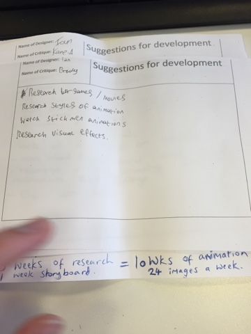
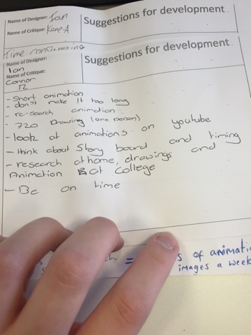
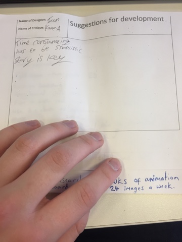
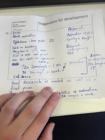
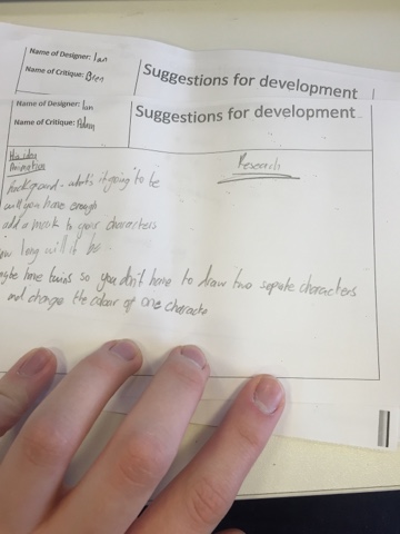
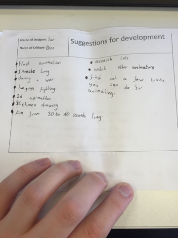
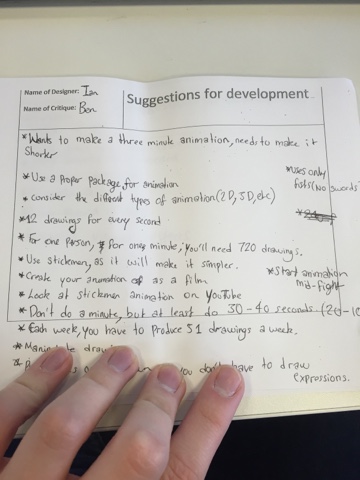
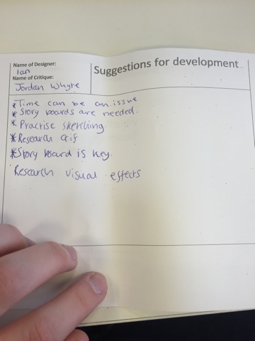
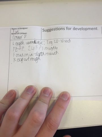
These critiques gave some valuable advice on how to adjust my FMP to more realistic standards. for example I was originally trying to create a 3 minute animation. With help from my peers I was advised to make it a 20 second animation, maybe 30 if I have time. This will allow me to focus on making the animation as smooth and professional as possible without worrying about time constraints as much as a longer animation would cause me too.
I was also advised to use proper software designed for animating, for which I will use adobe illustrator.
Tuesday, 1 March 2016
Mood Board
This mood-board incorporates many images that will be important to the development of my final project. The mountains in the top row will be used to develop the background of my final animation. The images of the martial artists will be used to base many of the actions that my characters perform.
Initial Sketches
These are a few initial sketches that I have prepared to demonstrate a few possible actions my animation may include.
Whilst one character is shaded this will not be the case in the finished product.
Friday, 26 February 2016
Final project proposal
The reasoning behind using adobe illustrator for animating rather than Photoshop, like we have used in the past, is because illustrator is designed for adjusting images and frames much easier when compared to Photoshop. this also means it will take much less time to complete my goal of a final animation.
Subscribe to:
Comments (Atom)


